When thinking about a TV sponsorship sequence we immediately thought of sequences before weather forecasts. As this was our immediate thought we decided that we should do the same because that was our first thought for sponsorship sequences which could mean that we are most exposed this particular form of sponsorship. We also thought that we could link the weather to our advert, as featured in our advert is the drink bringing colour back into a workout which has similarities to the people looking at weather forecasts to brighten up their day.
Advert 1
The above sponsorship sequence was shown before ITV national weather forecasts. This advert is similar to their main TV advert but shorter. They also have adapted the lyrics to their song to fit the theme of weather forecasts, which they are sponsoring. Sponsorship sequences consist of a opening bumper to the programme in question and a closing one. This particular clip features before and after the weather forecast. This method is not uncommon as it saves money for the company and also the repetitive nature gets the product/service known to the viewers. This is also helped by the catchy nature of this particular sequence which not only has a catchy song for viewers to learn it also has words in a karaoke style along the bottom. This particular sequence is 15 seconds long, most TV companies won't permit sequences much longer than this because of the tight TV schedules. With such a short time on screen it is vital that the brand name is shown for the majority of the advert. In this particular case their is a black banner at the bottom of the screen displaying the programme being sponsored and the company that is sponsoring.
Advert 2
Despite deciding that we wanted to make a sponsorship sequence for the weather, we thought it important to analyse sponsorship sequences for programmes as well. This particular advert is for Cadbury sponsoring Coronation street. The first difference between the previous sequence is that this sequence has nothing to do with Cadburys TV adverts. This may be due to the nature of the product being advertised, however as Cadburys adverts regularly change. This advert, like the previous, has a relation to the programme being sponsored. In this case the street is made of chocolate. Because their are more advert breaks in a TV programme than a weather forecast it gives the opportunity to make a mini series out of the sequences, which is a more light hearted version that the programme being sponsored. The break bumper (shown below) is shorter than the others and is very simple giving the logo of the programme and the sponsor with little else in terms of information. The same voiceover is used for all sequences, saying the exact same phrase which is memorable.
Wednesday, February 29, 2012
Editing the Advert
Before editing the advert we encountered a small problem. The cameras we used recorded and saved to an AVI file. This was not accepted by iMovie that we were using on the macbook. We therefore had to convert the files to a compatible MP4 format using a converter found on the internet. Luckily this did not disrupt the quality of the files.
 Our first job was to import the newly converted files into iMovie. Once imported and added to the project we decided to remove the colour from the clips that are before the drink is filmed. Luckily iMovie has a designated black and white setting which we applied to the required films.
 The screenshot to the left shows us removing the sound from our recorded clips. We did not want any diegetic sound in our clip, especially with the soundtrack over the top


Whilst in the editing process we decided to add text along the bottom of the screen. This is present in so many adverts and is required to make our advert meet the regulations enforced by the ASA as without it our advert could be considered misleading and possibly removed from the TV which would cost money.


 For the end of the advert we decided to have our brand name exposed once more to get the name out to the public faster. I also decided to include the three sponsors that featured on the label. If they were real sponsors this may be a requirement, it also has benefits for our brand however as it suggests to any viewers that if its good enough for top athletes then its good enough for them. Because we had three sponsors on the label we had to include all three in some way on the advert. However all three logos on one screen looked untidy and as the picture is only on screen for a few seconds their wasn't enough time for all three sponsors to be seen and absorbed by the viewer. I therefore decided to make three different endings to our advert which we could then add to a duplicate advert.


This next screenshot shows Adam adjusting the brightness on the slow motion clip. The brightness was only a problem after the transition to colour was in place. By lowering the brightness we made the advert flow and continuity was restored.

The screenshot above shows us cutting the song for different scenes of our advert. The song is not chronological as it appears in the advert as we have used different parts of the song to reflect the images that are on screen. For example when drinking we have made the lyrics 'I get a feeling that i've never had before' play which implies that drinking Regenerate gives you a feeling like no other.

The above screenshot shows a section where Adam is running across the bridge. Because of the difficulties involving panning it was vital that we used fast changes of scene to imply speed. This shows that four different scenes were used in as many seconds giving any viewers the impression of speed, especially as it happens just after the slow motion footage.

Whilst in the editing process we decided to add text along the bottom of the screen. This is present in so many adverts and is required to make our advert meet the regulations enforced by the ASA as without it our advert could be considered misleading and possibly removed from the TV which would cost money.
To exaggerate the effect that Regenerate has we altered the speed of the clips before Adam has drunk the drink. It also suggests that the runner is really struggling before he has a drink therefore emphasising the effect of Regenerate through the sprint finnish.

This screenshot shows that we stablalised many of the clips in order to reduce and shaking in the camera. Although we used a tripod for many of the clips it was still necessary to stabalise a few clips to create the proffessional feel that we desired. By stabalising the clips it made sure viewers could concentrate on the message of the advert rather than any unstable clips.


 For the end of the advert we decided to have our brand name exposed once more to get the name out to the public faster. I also decided to include the three sponsors that featured on the label. If they were real sponsors this may be a requirement, it also has benefits for our brand however as it suggests to any viewers that if its good enough for top athletes then its good enough for them. Because we had three sponsors on the label we had to include all three in some way on the advert. However all three logos on one screen looked untidy and as the picture is only on screen for a few seconds their wasn't enough time for all three sponsors to be seen and absorbed by the viewer. I therefore decided to make three different endings to our advert which we could then add to a duplicate advert.
Filming Our Advert
Equipment Required For the Days Filming
We decided to film our advert chronologically, in other words as it would appear in the final product. This allowed us to picture the final product in the filming stage and film from as many different angles as possible to ensure that we had covered every eventuality. After recording the inital running sequence, before Adam had drunk Regenerate, we set about filming the slow motion drink.

Haran, as Camera 2, was in charge of filming the slow motion part of the video. I directed him to film as close as possible to get the brand name as large as possible and making it easily readable. Despite this we wanted to show Adam actually drinking the drink to make sure that the viewers know that drinking the drink has had an effect later on in the video. We also wanted to show Adam's face so people could see that he'd been exercising for a long period of time and yet he still had the energy to sprint afterwards thanks to our energy drink.
 We did have a few problems however. First pictured left was the cameras heavy battery consumption. Even after a few seconds of filming we were getting low battery messages. This was inconvenient and even though we had planned in advance and brought spare batteries this was still not enough as we didn't have the quality of film we desired when we viewed it whilst editing.
 This meant we had to film the slow motion part again. For continuity we made sure Adam wore the same clothing and also refilled the bottle to the same level as when we started. The picture on the right show the filming of the actual footage we used in the final product. The only problem was it was brighter when we returned to film the slow motion part something we would have to tackle in the editing process.
 After we had filmed the slow motion part we set about the sprint across the bridge to finnish our advert. Our first issue was the fact the bridge was the only route across a certain path. This meant that should we encounter any pedestrians then we had to stop filming and let them get out of shot. This made filming difficult especially as we wanted no one else in the shot to give the effect of isolation to exaggerate the effects of Regenerate. The narrowness of the bridge also meant there was not enough room for a panning shot. This would have emphasised the extra speed Adam had gained as a result of the drink. We therefore decided to do lots of different shots in short bursts. Then when we came to editing we could use fast changes of scene which would give viewers the impression of the speed he was going as a result of the drink.
 At the end of the bridge we decided that Adam should finnish as if he was racing. This would once again show the speed in which he was going and that Regenerate brings out your competitive side. Also by doing such a finnish it would imply that Regenerate can give you the edge when you need it. The picture on the right shows Adam trying to do the finnish. After a few takes Haran showed Adam how to make it look realistic which Adam took on board and we had the effect that we desired.

For the ending shot we had originally decided that we would cut to a picture. To keep our options open however and a brainwave I had whilst filming the above shot I thought it would be good if after Adam had run past the bottle would appear on the railings behind him. This would however go against continuity but that was not an issue if this was executed properly. However due to the round nature of the top of the railings it was difficult to hold the bottle steady. We had to get Haran to hold the bottle at the bottom and film above his hand. After this we thought that our original idea would probably be more professional, but we left this decision until later in the editing process.
- Creative Vado HD Camera - for filming main shots
- Casio High Speed Exilim EX-FH20 - for filming close up slow motion drinking
- Adjustable Camera Tripod - to avoid camera shake which could cause an unprofessional feel
- Correct Clothing - to add authenticity and continuity should we need to film on more than one day
- AA Batteries (Including spares in case they ran out) - for slow motion camera
- Props (such as iPhone holder, headphones and bottle with label attached as shown in Costumes and Props post)
 |
| Picture showing Haran set up the tripod before we started |

Haran, as Camera 2, was in charge of filming the slow motion part of the video. I directed him to film as close as possible to get the brand name as large as possible and making it easily readable. Despite this we wanted to show Adam actually drinking the drink to make sure that the viewers know that drinking the drink has had an effect later on in the video. We also wanted to show Adam's face so people could see that he'd been exercising for a long period of time and yet he still had the energy to sprint afterwards thanks to our energy drink.
 We did have a few problems however. First pictured left was the cameras heavy battery consumption. Even after a few seconds of filming we were getting low battery messages. This was inconvenient and even though we had planned in advance and brought spare batteries this was still not enough as we didn't have the quality of film we desired when we viewed it whilst editing.
 This meant we had to film the slow motion part again. For continuity we made sure Adam wore the same clothing and also refilled the bottle to the same level as when we started. The picture on the right show the filming of the actual footage we used in the final product. The only problem was it was brighter when we returned to film the slow motion part something we would have to tackle in the editing process.
 After we had filmed the slow motion part we set about the sprint across the bridge to finnish our advert. Our first issue was the fact the bridge was the only route across a certain path. This meant that should we encounter any pedestrians then we had to stop filming and let them get out of shot. This made filming difficult especially as we wanted no one else in the shot to give the effect of isolation to exaggerate the effects of Regenerate. The narrowness of the bridge also meant there was not enough room for a panning shot. This would have emphasised the extra speed Adam had gained as a result of the drink. We therefore decided to do lots of different shots in short bursts. Then when we came to editing we could use fast changes of scene which would give viewers the impression of the speed he was going as a result of the drink.
 At the end of the bridge we decided that Adam should finnish as if he was racing. This would once again show the speed in which he was going and that Regenerate brings out your competitive side. Also by doing such a finnish it would imply that Regenerate can give you the edge when you need it. The picture on the right shows Adam trying to do the finnish. After a few takes Haran showed Adam how to make it look realistic which Adam took on board and we had the effect that we desired.
For the ending shot we had originally decided that we would cut to a picture. To keep our options open however and a brainwave I had whilst filming the above shot I thought it would be good if after Adam had run past the bottle would appear on the railings behind him. This would however go against continuity but that was not an issue if this was executed properly. However due to the round nature of the top of the railings it was difficult to hold the bottle steady. We had to get Haran to hold the bottle at the bottom and film above his hand. After this we thought that our original idea would probably be more professional, but we left this decision until later in the editing process.
Tuesday, February 21, 2012
Creating Our End Of Advert Picture
In order to get the brand name well known we need to show our product as much as possible. We therefore decided to create a picture to go at the end of the advert showing the product. As a main theme in our advert was to bring the colour back into the workout we decided to continue this for the end of our advert. We decided to have the background in black and white and the product in colour, this would make the product stand out more as well as continue the theme of the advert.

 This screenshot shows the editing process. At this particular stage the picture has no colour at all. This would meet our criteria for continuing our colour theme but did not make our product stand out. Adam therefore shades the part of the image that we want to be in colour. The picture on the right is the finished picture and is the one we will use.
This first picture is our product laying on the rocks that we would use for end of our advert. This picture was taken on Adam's iPhone because he could then use the 'ColourSplash' app to edit it to our specification.
This screenshot shows the editing process. At this particular stage the picture has no colour at all. This would meet our criteria for continuing our colour theme but did not make our product stand out. Adam therefore shades the part of the image that we want to be in colour. The picture on the right is the finished picture and is the one we will use.Wednesday, February 15, 2012
Internet Pop Up Advert
After viewing various different pop up adverts we had come up with an idea for our own. From our research we decided that the simpler and eye catching pop up adverts are the most effective.
We wanted our advert to be instantly recognisable. Therefore we decided to keep a similar colour scheme but one that stood out more than the one on our label. We stuck with the fading effect because not only is that similar to the effect on the bottle label, it also fits in with our TV advert which involves colour fading out of the workout. We did change the yellow to an orange which is brighter and more likely to stick out on websites, especially those that use dull colours.
We also wanted the website to appear on the bottom of the advert. This would get our brand name out to the world and also even if the user didn't click on the advert they may notice it and the website along the bottom and visit it another time. We also wanted to use the stick man used on the bottle as a part of the logo for the Regenerate brand. This would help to make our brand more recognisable and more renowned.
As far as information on the website goes we decided to keep it simple as too much information can cause viewers to become disinterested especially if the information does not apply to them. We decided to use 'Prolong Your Workout.' This particular saying links into our advert in which our runner prolongs his workout by drinking Regenerate.
Originally we wanted the a small stick man, similar to the one featured on our logo, to run across the advert before pausing and then continuing to the end. This would also act as a reference to our advert as well as making our advert stand out even more. After the man had ran across we wanted our 'Prolong Your Workout' saying to appear. However this turned out to be difficult to make it look like a proffessional advert and we thought it may put people off if our brand was percieved to be unproffessional. We therefore changed it and decided that we would make the 'Prolong Your Workout' grow and shrink in order to catch the viewers attention.

This is our finnished pop up advertisement. When clicked it will link to our website. The only slight issue is that this advert was made before we made our website, which we had to make using Weebly due to the costs of hosting your own website. The animation grabs the attention of anyone who sees it. After a while it could be considered annoying but we have seen with adverts, such as gocompare, that this can sometimes be affective.
If we were to publish this onto the internet then we would target sports websites, possibly ones that we have sponsored. This would achieve the maximum number of people in our target audience without spending vast amounts publishing it on many websites.
If we were to publish this onto the internet then we would target sports websites, possibly ones that we have sponsored. This would achieve the maximum number of people in our target audience without spending vast amounts publishing it on many websites.
Sunday, February 12, 2012
Analysing Internet Pop Up Adverts
Good advertising campaigns have more than one form of advertisement. To supplement our TV advertisement we decided to make an internet pop up advert. In order to create an internet pop up advert that would grab the attention of the viewer we needed to analyse current internet pop up adverts in order to help us create the best possible pop up advert.
Advert 1

This first internet pop up advert was seen on sticksports.com. This is clever placement as many visitors to this particular website are likely to have an interest in sports, which is what this pop up advertisement is about. This advert doesn't immediately jump out at the viewer however the use of a question is interesting as it engages anyone who sees it making them feel valued and therefore more likely to click it. This particular advertisement isn't animated which we originally associated with internet pop up adverts. However the question used is just as a effective as it implies if you do like rugby league then clicking this link may be of interest to you.
Advert 2

The second pop up advert was found on a youtube converter site. This is likely to be used by the masses which is reflected in the advertisement shown which is fairly general and may interest a large number of viewers. This has small animations on the important information which makes it stand out and grabs your attention. Then once it has grabbed the users attention it then makes them think about the information on the advert making them more likely to click on the link.
Advert 3
 This pop up advert is a small flash movie found on the official premier league website. Barclays are a sponsor for the premier league which makes it a good place to put the advert. This advert features a windscreen wiper cleaning a screen and as it does so information appears about barclays and their service. The movie plays twice before finnishing with the final picture, shown on the left, which then stays until navigated away from the page. The animation is useful in grabbing the attention of the viewer but with so much information is only going to appeal to a small number of viewers.
Thursday, February 9, 2012
Costume and Props
 Authenticity is key in any advertisement to make it believable and therefore encourage viewers to buy the product being advertised. It was therefore vital that we made the actor in our video look like an average man going for a run as his form of exercise. As you can see from the picture Adam, the runner in our advert, is wearing clothing that would be familiar to any casual runners who view the advert. By making the advert as realistic and authentic as possible the effects that the drink has in the advert also seem realistic which could result in higher sales and a successful advertisement campaign. Snow is also on the ground which we used to our advantage as it makes the effects of the product look even greater as cold, wintery conditions are often the hardest to exercise in.
 The picture to the left shows the iPhone being used as music for the runner to listen to whilst exercising. This adds to the authenticity as many people listen to music as motivation whilst exercising. This motivation factor is also key in selling the product as it suggests to the viewer that Regenerate can keep you going even when the music can't. Also it fits in with the soundtrack of the advert and that is the song that the runner is listening to in order to keep going.
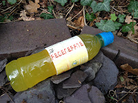
 In order to make the advert as professional and as effective as possible we needed to show the product so that viewers knew what was being advertised and what product to buy. Therefore we had to create a label to put on the bottle for the close up shots of the bottle. This label contained the Regenerate logo as well as the usual information found on drinks bottle labels. The label is colourful which is also a form of advertisement in itself as customers may be attracted to the colour of the product on the shelf. It is also a colour scheme used for other advertisements of this product so that consumers may begin to associate the colours of Regenerate whenever they see them if they are exposed to the campaign for long enough.
Subscribe to:
Posts (Atom)